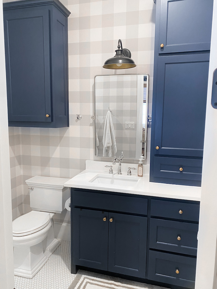
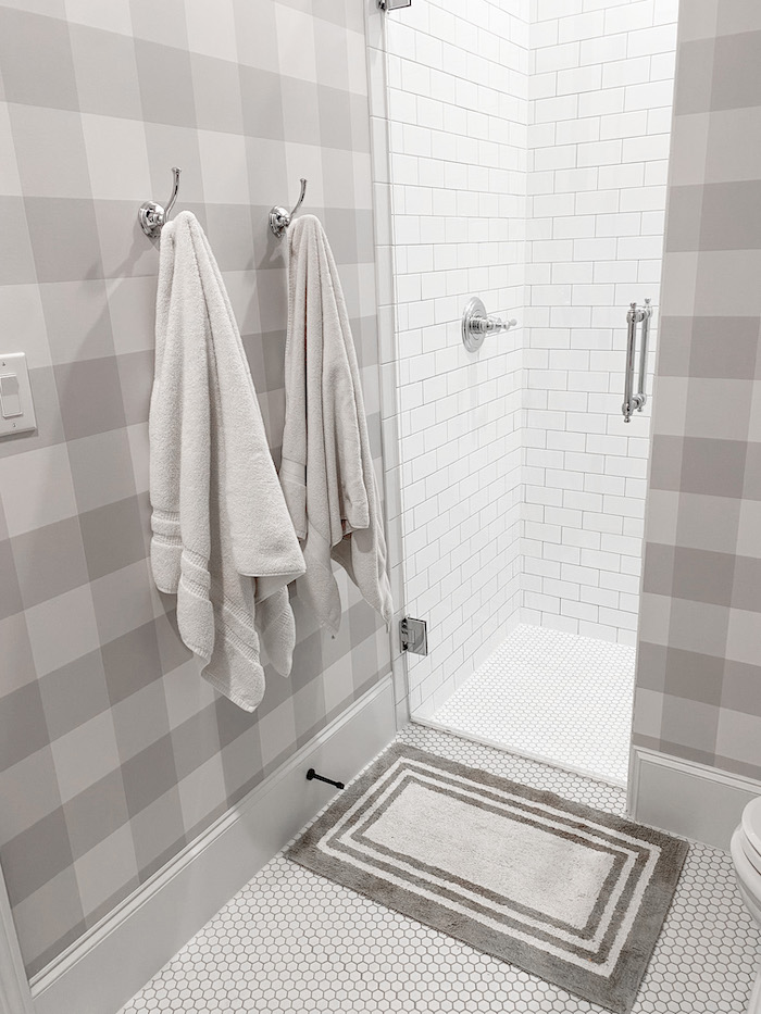
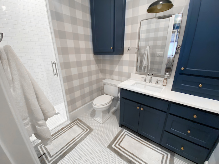
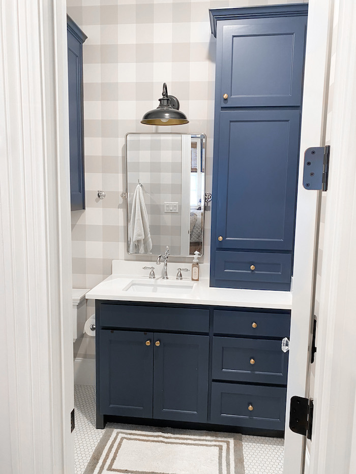
Braden’s bathroom design is classic, timeless, a bit nautical and will grow with him. It is crisp, clean and exactly what I was going for. Everything was very budget friendly! Here are all the details of Braden’s bathroom.
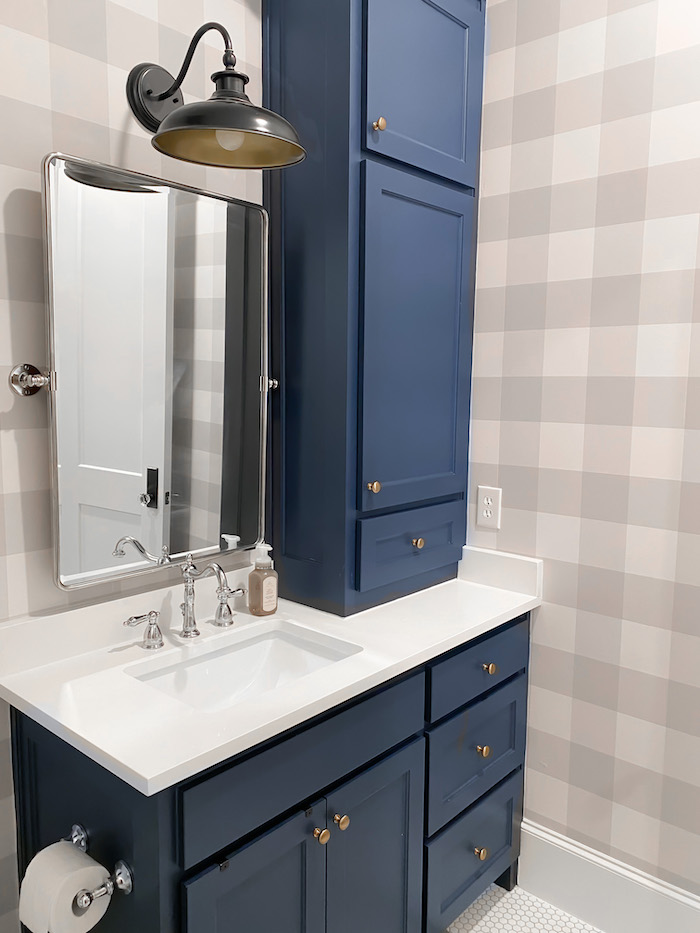
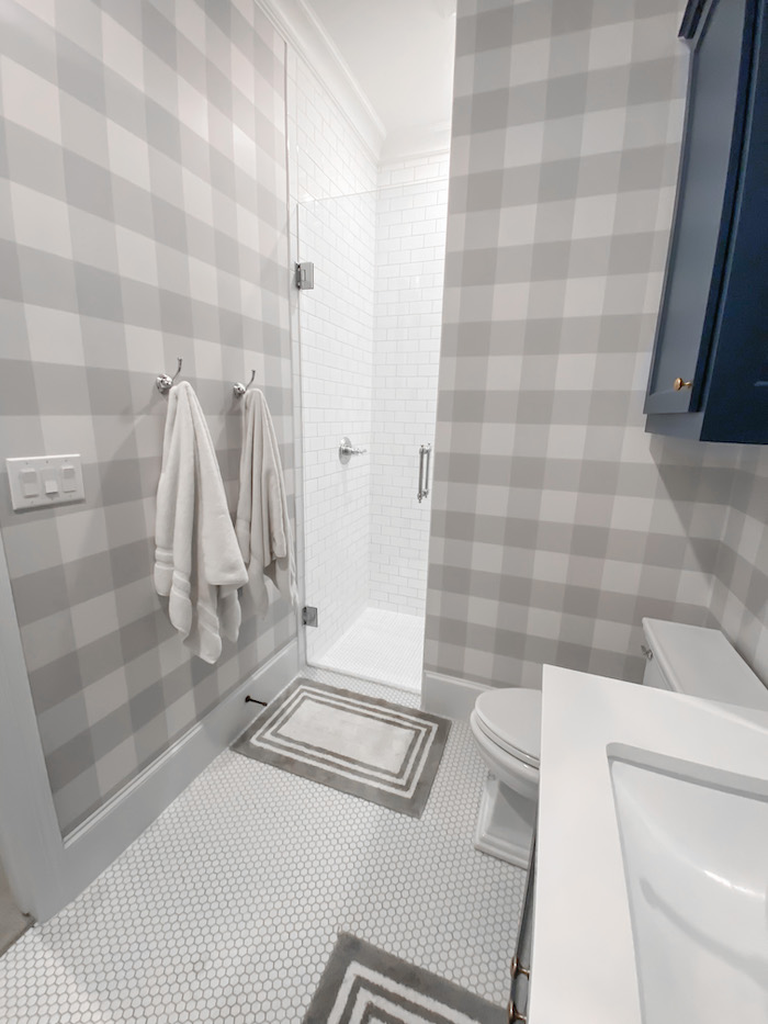
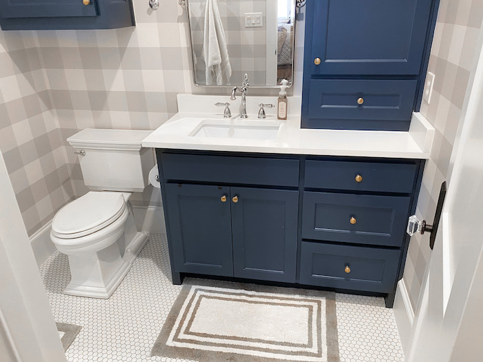
We used Benjamin Moore Hale Navy color matched to Sherwin Williams paint on his cabinets. I love the navy color. It is the same color we used in Geoff’s office. The counters are white quartz, the floor 1″ matte white hex tile and the shower walls are white glossy subway tile. Again, all timeless materials.
We used this inexpensive peel and stick buffalo check wallpaper to add more interest to the room. It really helped tie everything together. I love the print, its washable and removable.
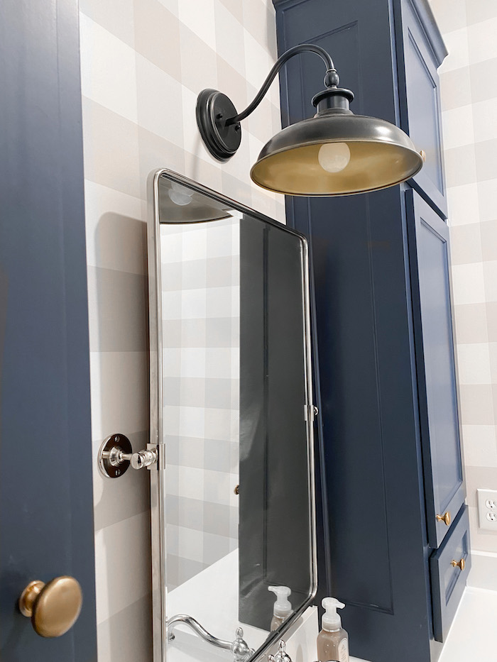
For hardware I wanted to mix metals. I used chrome on everything except the cabinet knobs. The knobs were an amazing Amazon find! Then I found this great light that mixed metals and coordinated perfectly.
The mirror is a great Pottery Barn dupe that I found on Amazon. The Amazon dupe looks really nice in the chrome and rubbed bronze, but for a brass finish the Pottery Barn option is better (the Amazon one looked kinda cheap . . . I ordered it and sent it back). I have the PB one in my pool bath.
Braden’s bathroom is a very simple design. Not a ton to it, but its exactly the look we were going for. I love how you can take inexpensive items and combine them for an overall higher end look! The kids were sharing a bathroom in our farmhouse rental so they are thrilled to have their own bathrooms now!
SHOP BRADEN’S BATHROOM
♥ SEE ALL NEW HOME POSTS HERE ♥
This post contains affiliate links. If you purchase I may receive a small commission. Thanks for supporting my blog.
**We are built our home with Joe Vastano with Joseph Paul Homes. The Joseph Paul Homes website is under construction. You can see his work on his Instagram and Facebook **

