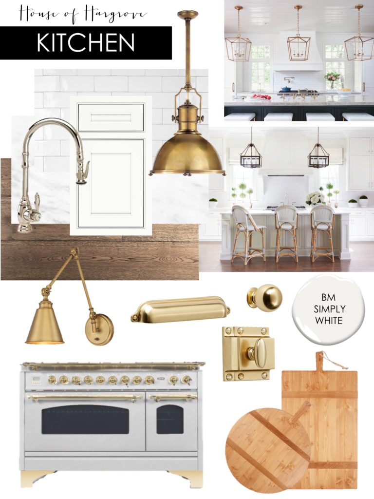
The kitchen is the heart of the home and where we all spend the most time. I want a gorgeous, timeless, bright kitchen. I have spend a lot of time thinking about this room and making sure I get it right to meet our family needs. Here is our kitchen design board.
Our kitchen will be white and bright. We will have 2 windows on either side of our vent hood that will look out into a little courtyard. Our layout is similar to our old home where our kitchen faces our family room and on the side is our breakfast nook/hearth room. I will be sharing more details about those 2 rooms later, but our kitchen is open to these other areas and I want everything to flow.
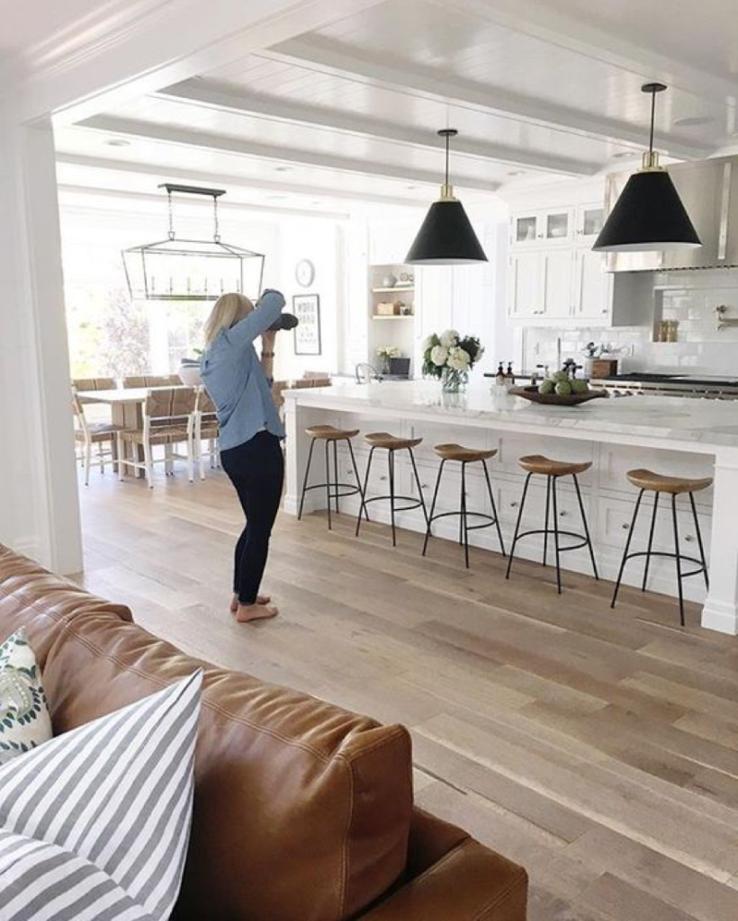
Currently our kitchen is designed to have a huge island similar to this layout.
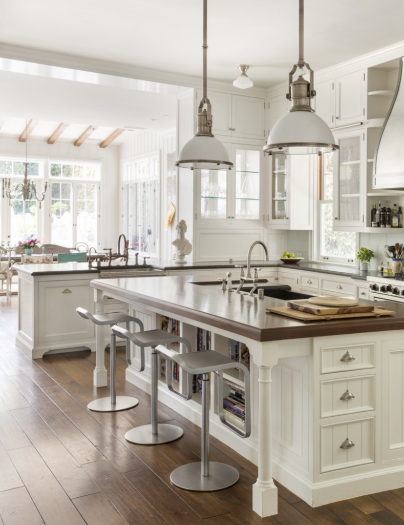
However, I am strongly considering making the island a little smaller and adding a peninsula counter on the side of our kitchen. I don’t have to decide until we get to the framing stage so I want to get in the space and see the feel for it. I like the peninsula counter, because it would be a great spot to put my kids when they eat, etc. It is very practical and I think would be used a lot. When we entertain we use the island like a buffet with all the food, so I would like another spot with barstools that I can have people sit at. Similar to this . . .
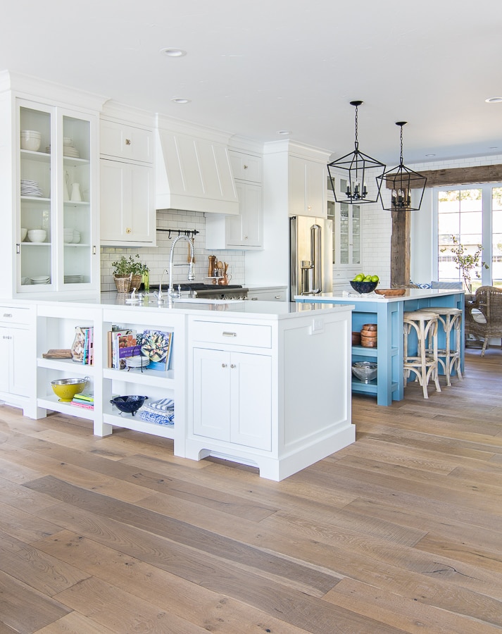
via Lilypad Cottage
My island would still be bigger than these and the peninsula wouldn’t stick out quite as far, but you get the idea. There is a doorway between the breakfast nook/hearth room and kitchen that leads back to the game room, etc so that will be a main walkway. I kind of like the idea of closing off my kitchen a little bit. I don’t love everyone walking through the kitchen while entertaining, I like more borders while still feeling open if that makes sense. The other side of the kitchen has a walkway to the butlers pantry and regular pantry and then leads into a hall that goes back to the laundry/mudroom/garage.
KITCHEN DESIGN BOARD
**YOU CAN HOVER OVER THIS PHOTO AND CLICK EACH ITEM TO SHOP**
We will have wood floors, marble counters, white subway tile backsplash up the entire back wall with light grey grout. Hardware and lights will be brass, sink faucet will be polished nickel, we will have a large white farmhouse sink and fridge/freezer/dishwasher will have custom panels to match our cabinets. I want a clean, bright space that is classic and timeless. I think I have decided to go with a custom grey range. I keep going back and forth. You can read more about our range/appliance decision here. I will be sharing a post soon with all of our appliance selections.
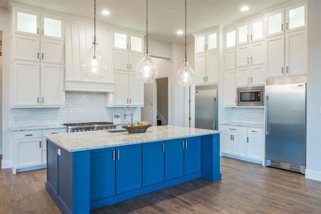
We will be doing a 30″ fridge and 30″ freezer with panels to match our cabinets. They will be separated by a build in microwave similar to this photo. We will then have a 2nd microwave and wall oven in our butlers pantry.
We still have a lot do to with the cabinet guy. We have a preliminary design, but I still need to really go over all the details. I know we are doing inset shaker cabinets with a beaded trim. As we finalize things I will share more, but this gives you a good idea of the direction we are headed.
You can check out our butler’s pantry design board here.

