I have said it before and I will say it again. . .paint is so hard! You see something you love in someone else’s house, online, etc and then you try it in your home and it looks totally different! Do yall feel me on this one?! Well, it is all based on lighting! Everyone’s house is different, shoot every room is different so it can really change what a color looks like. If it is something online it is most likely edited so that complicates things as well. We tried several white paint colors in our new home and today I am sharing the details and what we chose!
Again, the colors I chose will look different in your home, but it is a good starting point. There are a lot of popular whites out there that you will hear about a lot. It is helpful to start there and then you must do swatches in your own home. Also note, color matching is not always exact. Some colors don’t color match well as you switch brands because the bases are different. Darker colors are easier to get away with, but whites are hard! It can go too blue or too yellow very fast.
Things to think about . . . do you want a more cool white or a more warm white? Cooler tends to lean more modern and warm tends to lean more traditional. I wanted a warmer white in the interior of our home to give a cozy, more timeless feel.
INTERIOR
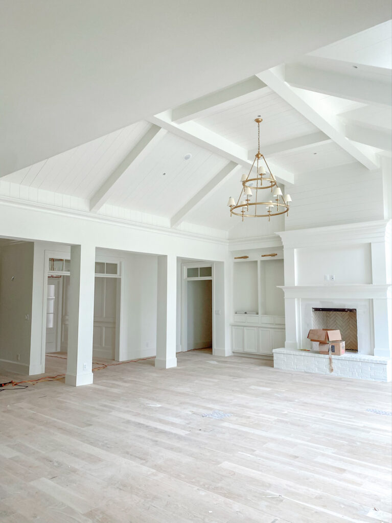
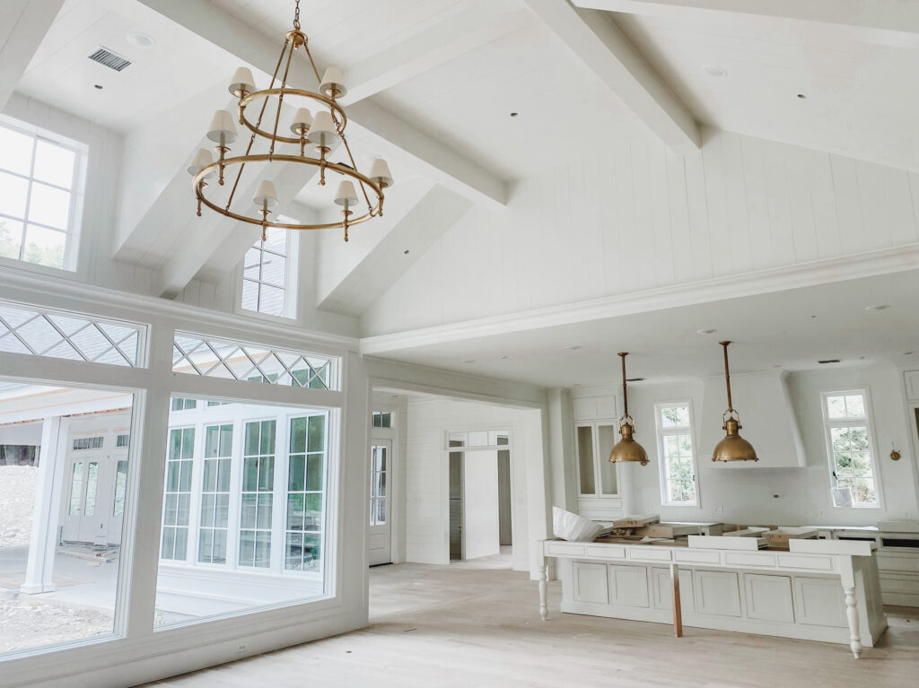
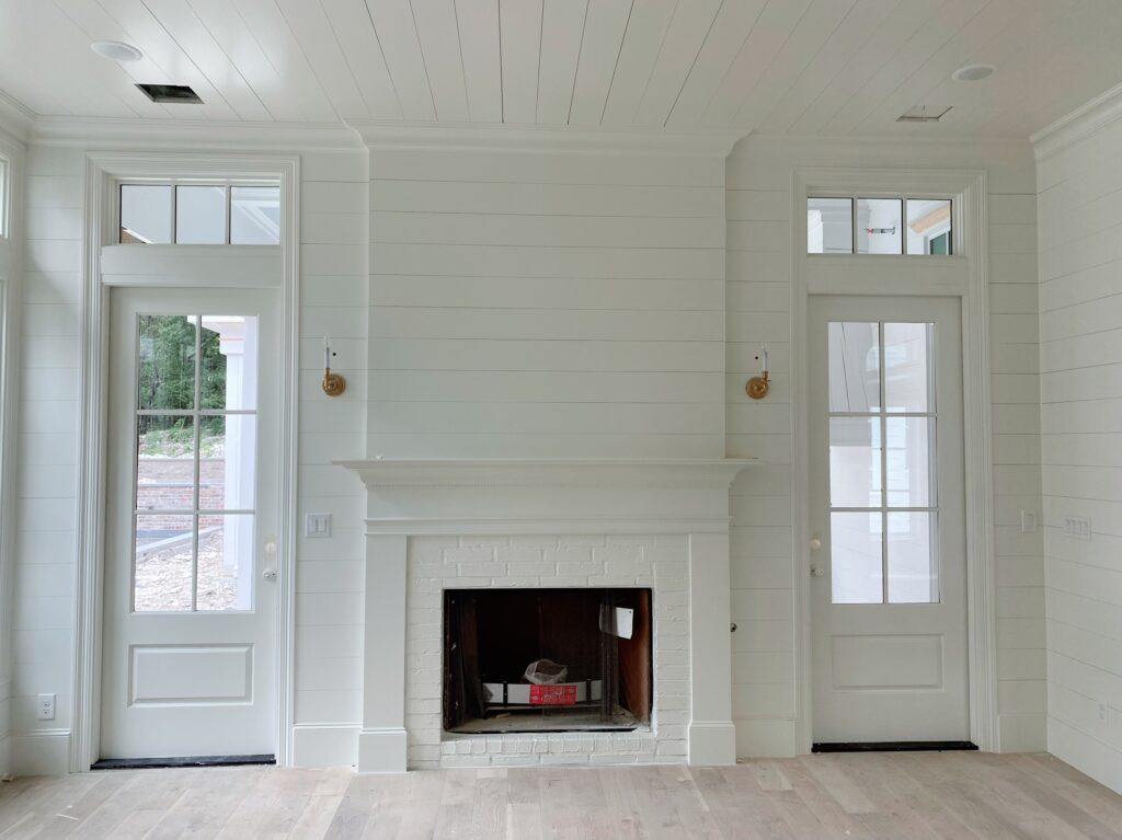
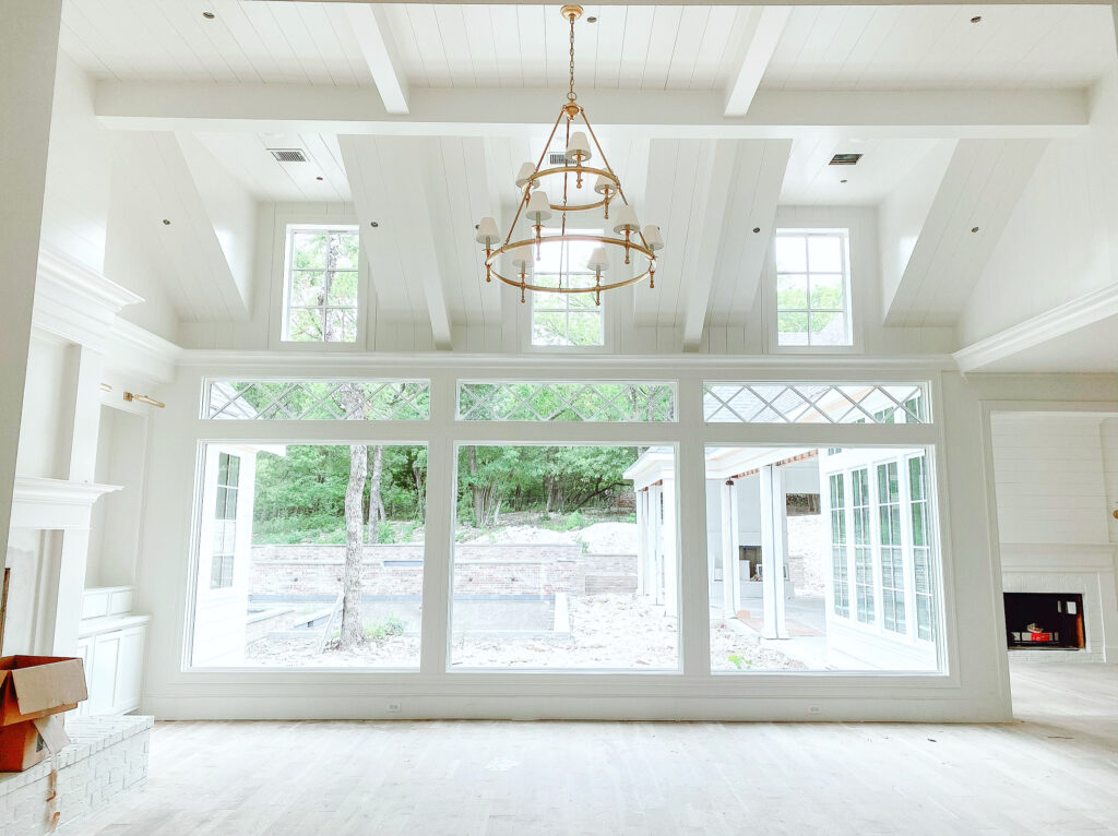
After trying many different whites for our interior, I narrowed it down to Sherwin Williams Alabaster and Sherwin Williams Snowbound. Both are gorgeous and I went back and forth, but ultimately went with Alabaster and I absolutely love it. The swatch we put up was reading a little yellow at first because it is definitely a warmer white, but when we got it up in the whole house it is perfect and exactly what I was going for. I used the same color everywhere. Trim, ceiling, cabinets, etc. If you see white in the interior of my home it is SW Alabaster. I used eggshell on the walls and satin on the trim.
EXTERIOR
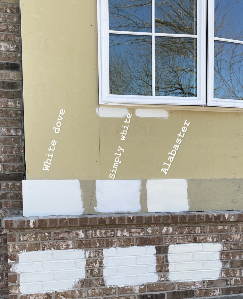
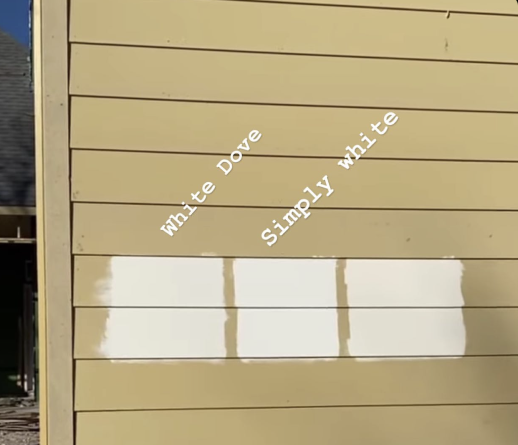
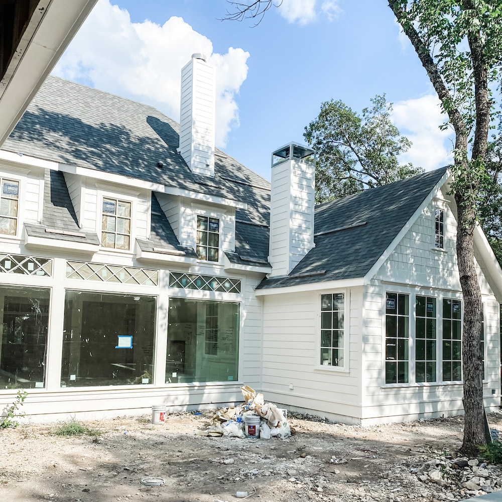
The exterior of our home was tough! I originally thought I was going with BM White Dove color matched to Sherwin Williams paint, but I put swatches up in several spots around our home and it started to look way to yellow in some areas. This is where lighting is so tricky. I liked it on the front of our house, but not the side. We tried several different color swatches. Below you can see that Alabaster, which is what we used on the interior of our home, looked really yellow outside. Simply White was more cool and White Dove looked perfect. Well, as the light changed throughout the day, etc none of these turned out to be winners.
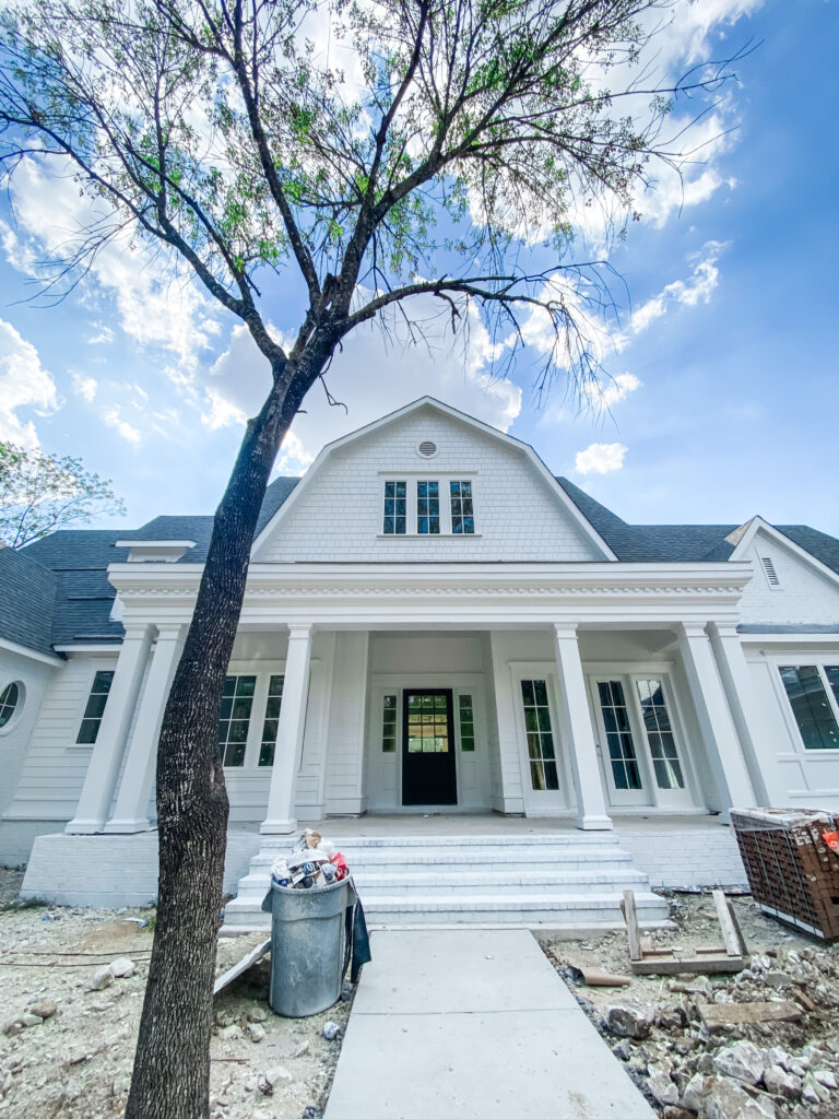
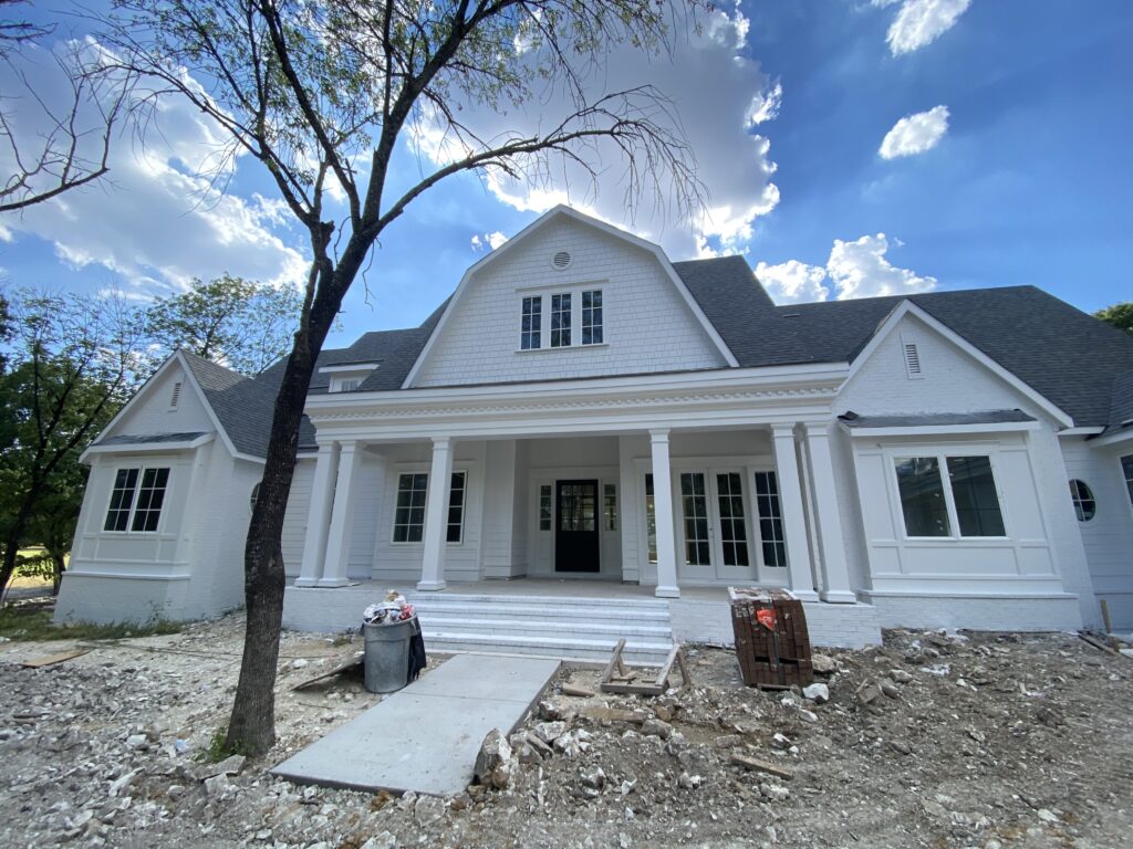
We ended up trying out more colors and the winner was Sherwin Williams Snowbound. It is so funny, because that was my 2nd choice for the interior! We live on a lot with lots of trees so the shade changed the color of the white. I think Snowbound might have been too crisp if it was in direct sunlight, but I loved it with the shade of our trees.
I am so happy with the way both whites turned out in and on our home. So just to recap. . . Sherwin Williams Alabaster on interior and SW Snowbound on exterior. If you are looking for a white for your home I highly recommend trying both of these colors as options. They are great universal whites that are very popular.
SEE ALL #HOHSOUTHERNCAPECOD POSTS HERE
**We built our home with Joe Vastano with Joseph Paul Homes. The Joseph Paul Homes website is under construction. You can see his work on his Instagram and Facebook **


Absolutely love everything about your house! Thank you do much in the choice of whites and how they looked on the interior and exterior. My house is a ugly faded red brick. I am thinking about painting it either white or light gray. Do you have any suggestions for the trim and shudder color?
Thank you so much! I think a light grey would be really pretty. Pinterest has some wonderful color combo boards that could be really helpful!