Last week I shared the design board for our laundry room and today I am sharing the design board for our butler’s pantry. I have always loved butler’s pantries and when we were working on our plans I wanted this room to be a good size with lots of natural light. Here are all the details.
Like my laundry room, the butler’s pantry is another room I wanted to keep classic, but fun. It is right off my kitchen and our food pantry is adjacent to it. Our food pantry will be more utilitarian and have a cute blue swing door, but the butlers pantry will be directly across from it and open. One side will be all windows and the rest cabinets, shelves and drawers. I want it to feel like an old apothecary store, retro candy store, cute little bakery, something like that. Very cozy and charming.
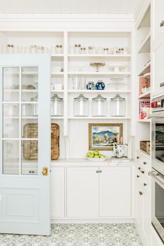
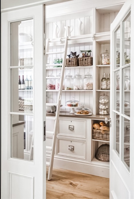
I love Rachel Parcell’s and Hayburn & Co.’s butler pantry designs.

via Rachel Parcell

Via Hayburn & Co
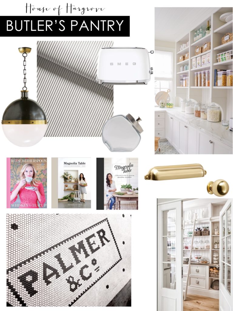
I still have a few things to figure out, but here is the design for my butler’s pantry.
butler’s pantry design board
**YOU CAN HOVER OVER THIS PHOTO AND CLICK EACH ITEM TO SHOP**
We will be doing white cabinets, marble counters, bead board trim thorough out and a simple stripe wallpaper on the ceiling. I wanted a neutral palette so my cute cookbooks and jars with treats, etc would stand out. I want the floors to be really fun as well and I shared some hexagon tile inspiration earlier this week as to what I am going for. Figuring out what I want it to say is the hardest part! I am leaning toward a border with either a number or a word. I love the way No. and Co. look in the tile.
So many decisions! I will keep you posted. Do you have any ideas for what I should do?!
SHOP BUTLER’S PANTRY
PIN BELOW FOR BUTLER’S PANTRY DESIGN BOARD
This post contains affiliate links. If you purchase I may receive a small commission. Thanks for supporting my blog.


No Place Like Home
House of Hargrove